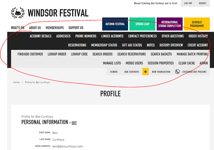
The Windsor Festival have a snazzy new site here:
https://tickets.windsorfestival.com/sales/
One way in which we’ve iterated the design with respect to our menus and the constant problem of there being sets of navigation competing with each other - the navigation designed by the site designers vs our menus - is that we’ve made our menus horizontal and permanently visible along the top (when the screen is wide enough) which I quite like:

