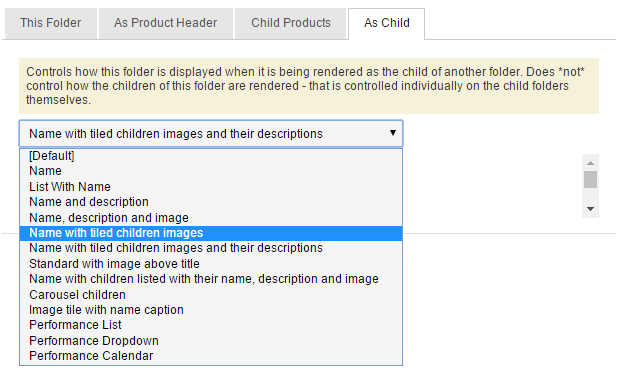
Today we’ve been thinking about the tiled display mode for rendering folders as children:

Many sites have a tiled image with overlaid text to list shows on the home page, or under categories or genres. These tiles are also often used for showing recommendations for other shows or products, sometimes on a folder and sometimes on the basket like this:
The size of these tiles is set in the stylesheets for the theme, defining how many tiles should fit across the page, at different screen resolutions.
We were thinking that having more control over the size of these tiles might be useful.
An easy change would be to introduce a “small tile” option with a different width setting. This means some folders could render with 4 tiles across and others with say 6, so some tiles are given more prominence. But this wouldn’t allow us to render the same folder big in some places and small in others.
Does that sound useful?
Or is there a need for more control over how tiles render? What would you like to be able to do with display options?
An option to override theme stylesheets might be useful - we have the odd category where not enough happens to make the theme look ‘neat’ (eg only two tiles in a three tile theme) - which makes my eye twitch a bit sometimes. To be able to say how many tiles should be in a row would be great. That might be a mixture of a seleciton thing (eg I know I will only every have two tiles for this particular folder, so I want big tiles) and a reactive theme thing for folders where events are regularlly popping in and out and a one size fits all might not work…(eg normally uneven no of tiles in a row, but if only even nos of tiles available make tiles wider over multiple rows?) Being able to specify tile size for certain categories (eg our film category where we have a signficiantly larger number of events than anything else) might also reduce scrolling in full categories.
2 Likes
So at the moment the option is just “tiles” and the theme specifies the size.
What we could do @andrewcurthoys is have controls for
Tile (1 to a row)
Tile (2 to a row)
Tile (3 to a row)
Tile (4 to a row)
Tile (5 to a row)
in every theme, and then the choice becomes “which widget do you choose”, and that way we don’t need to decide sizes when we’re building the theme, we just always implement all the classes. And then if someone doesn’t want to see the choice, we just remove the extra widgets from Admin.config and rename the one they want back to just “Tile”.
And then we make it so that different widgets operate different as the browser size changes, so that 4 can collapse to 2 and 2 to 1, but 3 and 5 just shrink and then collapse to 1 and don’t go in between.
yep. starts to sound a bit like bootstrap.
where you define a div like this:
<div class="col-xs-6 col-md-4">... </div>
and styles like:
.col-xs-6 {
    width: 50%;
}

@media (min-width: 992px)
.col-md-4 {
    width: 33.33333333%;
}
where lg, md, sm, xs correspond to width transitions in the media queries.
so when the screen width is md show 3 tiles across, and when its xs show only 2.
A new version of the front end could be build on bootstrap.
not sure if it would make integrating with sites that already use bootstrap harder or easier, and similar for those that don’t use it.


